Overview
Building Tomorrow's Enterprise Solutions
Movara specializes in custom management systems and proprietary software for national enterprises, turning complex workflows into streamlined digital solutions.
Every project is engineered with precision to deliver tools that are efficient, scalable, and seamlessly integrated into each client's operations. In an industry where visual identity can mean the difference between standing out and blending in, the brand needed to immediately convey innovation and reliability.

Problem
Finding the Sweet Spot
The main challenge was creating a recognizable brand that could differentiate itself through form and feeling, striking the right balance: professional enough to inspire confidence with enterprise clients, yet approachable enough to signal forward-thinking and agility.
The brandmark needed to visually communicate that Movara stays ahead of the curve, embodying momentum and vision without falling into predictable or generic territory.


Result
Design with Direction
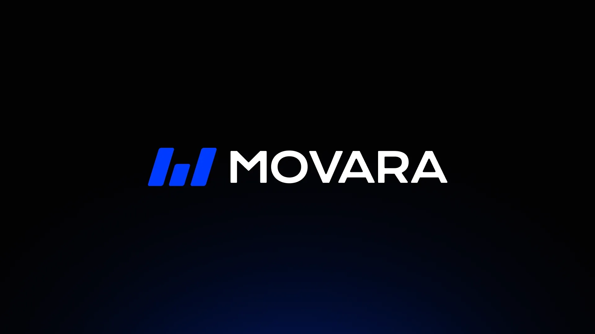
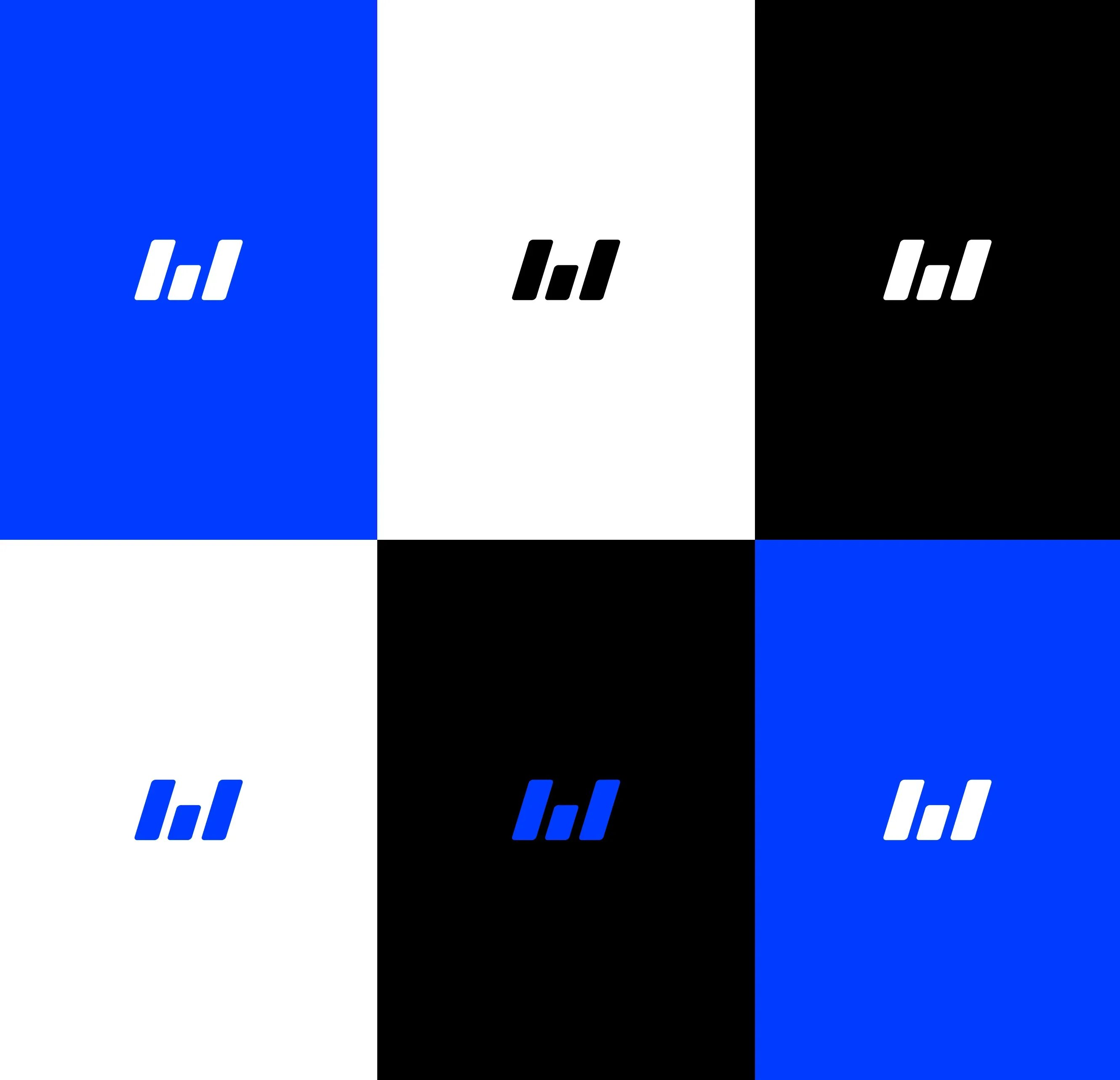
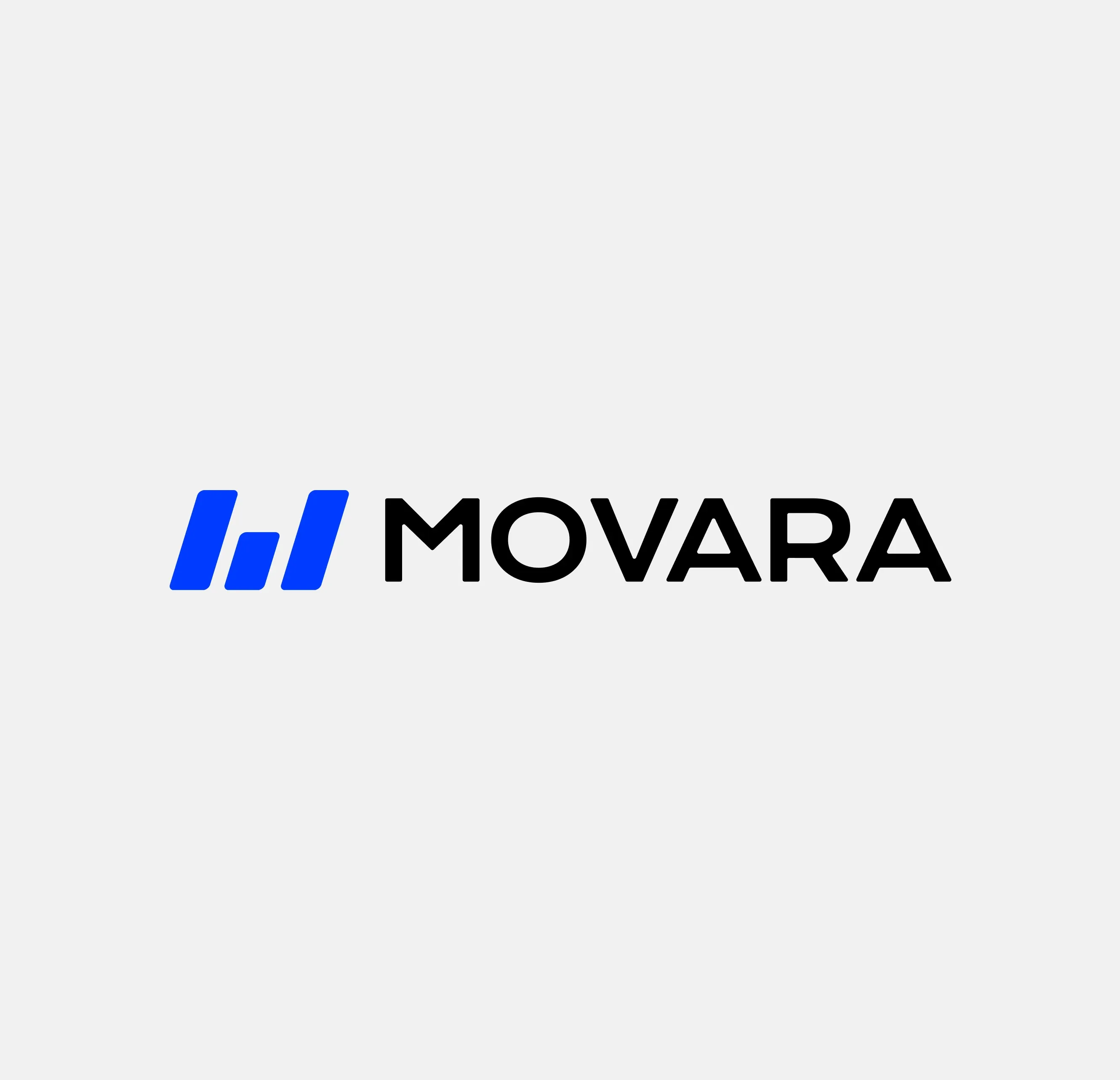
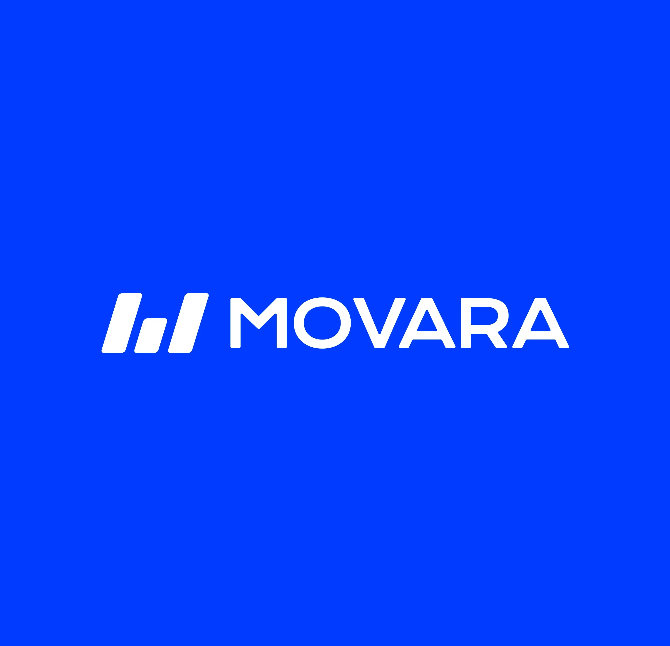
The logo merges the concept of "forward momentum" by tilting rightward, naturally suggesting progress and trajectory. The three lines form an M for the company's initial while simultaneously creating a unique symbol that works independently across different contexts, functioning both as a complete wordmark and as a standalone graphic element.
This versatility allows the brand to adapt fluidly across touchpoints while maintaining its distinctive identity, feeling modern without being trendy, professional without being stiff.